Design product pages best practices
If you own an online store, you understand the importance of having product pages that attract, inform, and persuade potential customers. Design product pages are where you display your products, highlight their features and benefits, and persuade visitors to add them to their shopping cart.
But how do you design sellable product pages? What are the components of an effective product page design? And what are some examples of design product pages that do it right?
This blog post will address these and other questions. We will show you great product page design examples from various industries and niches and explain why they are effective. We will also go over some best practices and pointers on how to design sellable product pages on your own.
Let’s get started!
What is a product page?
A product page on your online store is a web page that displays a single product or a group of related products. It is where you give a visitor all the information they need to make a purchase decision, such as:
- Product name
- Product images or videos
- Product description
- Product price
- Product availability
- Product variations (such as size, color, or style)
- Product reviews or ratings
- Product specifications or technical details
- Product warranty or guarantee
- Add to cart or buy now button
- Related products or cross-sells
A product page is one of your website’s most important pages because it is where conversion occurs. A well-designed product page can boost sales, lower bounce rates, and boost customer satisfaction.
What are the elements of a great product page design?
Design product pages is creating one that:
- Captures the attention of the visitor with a clear and compelling headline and a high-quality product image or video.
- Provides all the necessary information about the product in a clear, concise, and engaging way, using bullet points, subheadings, icons, or charts.
- Highlights the unique value proposition of the product, such as what problem it solves, what benefits it offers, or what makes it different from its competitors.
- Builds trust and credibility with social proof, such as customer reviews, testimonials, ratings, awards, or certifications.
- Creates a sense of urgency or scarcity with limited-time offers, discounts, countdown timers, or stock indicators.
- Encourages action with a prominent and persuasive call-to-action button that stands out from the rest of the page.
- Enhances the user experience with easy navigation, fast loading speed, mobile responsiveness, and interactive features such as zooming, rotating, or customizing the product.
Great product page design examples
Now that you know what makes a great product page design, let us look at some real-world examples from various industries and niches. We will look at what they are good at design product pages and what you can learn from them.
1. Bahama Buck’s
Bahama Buck’s is a chain of shaved ice shops that sells tropical-themed snow cones. Their product page design is so enticing that it literally motivates the viewer to go to a physical store. And this is what we call a product page design that sells!
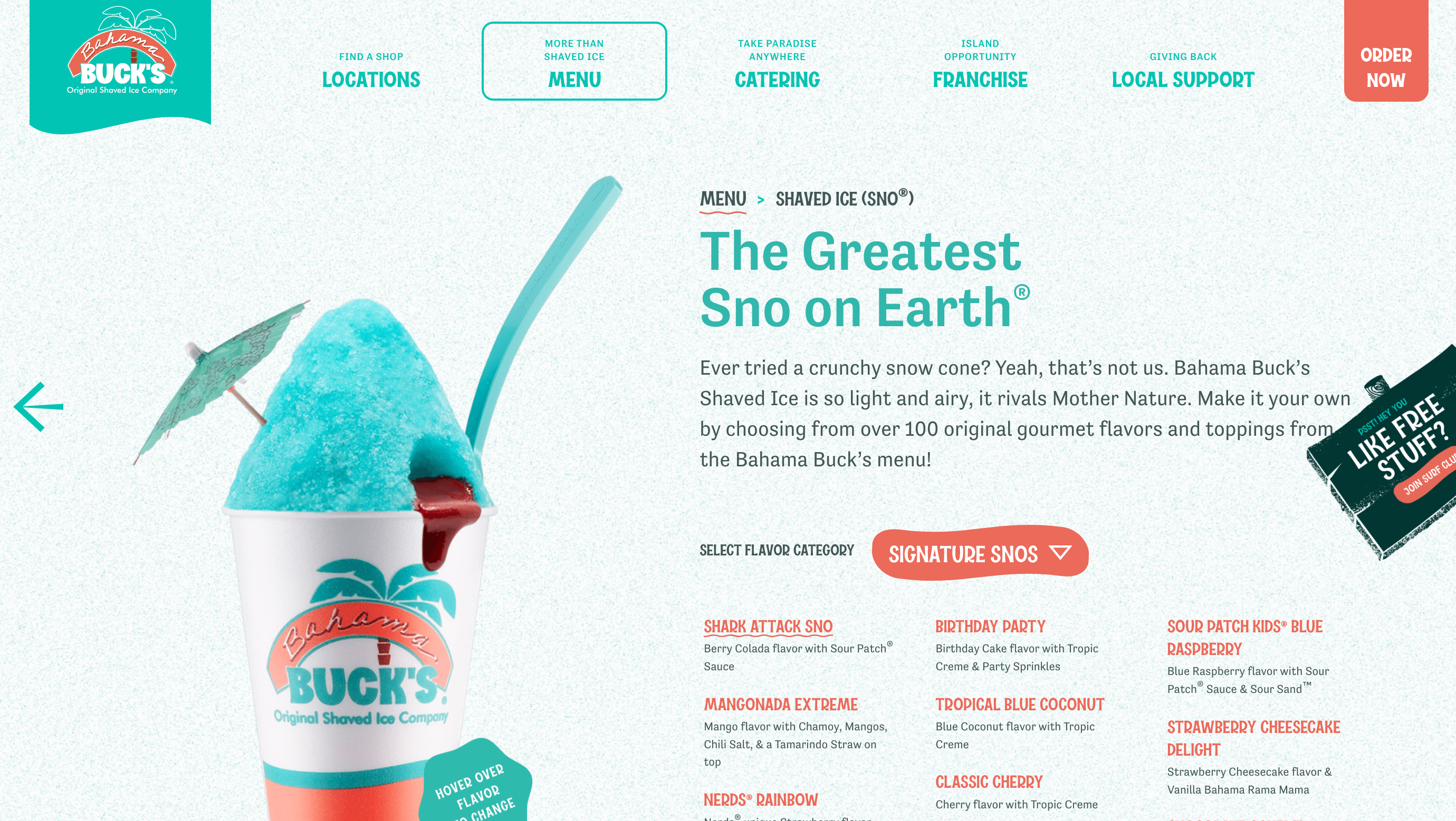
What they do well:
- They use bright and colorful images that showcase their products in an appetizing way.
- They use catchy and descriptive headlines that highlight their flavors and ingredients.
- They use icons and bullet points to summarize their value propositions, such as “100% natural”, “no artificial flavors”, or “gluten-free”.
- They use a map feature to help visitors find their nearest location and order online.
What you can learn from them:
- Use high-quality images or videos that appeal to your target audience’s senses and emotions.
- Use clear and catchy headlines that communicate your unique selling points.
- Use icons and bullet points to make your information easy to scan and digest.
- Use interactive features that enhance the user experience and facilitate the purchase process.
2. ZARA Product Pages
Zara is a global fashion brand that offers trendy clothing and accessories for men, women, and kids. Their product page design is simple yet elegant, reflecting their brand identity and style.
What they do well: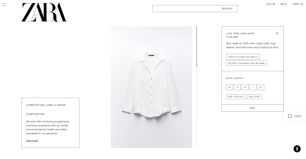
- They use large and crisp images that show their products from different angles and on different models.
- They use minimal text and let their images speak for themselves.
- They use subtle animations and hover effects to create a dynamic and engaging experience.
- They use a sticky bar at the bottom of the page that displays the product name, price, size options, and add a bag button.
What you can learn from them:
- Use large and crisp images that showcase your products in detail and in context.
- Use minimal text and focus on the most important information.
- Use subtle animations and hover effects to create a dynamic and engaging experience.
- Use a sticky bar or a floating button to keep your call to action visible at all times.
3. Sandy Gray Whisky
Sandy Gray Whisky is a premium whisky brand that offers a range of single malt and blended whiskies. Their product page design is sophisticated and elegant, reflecting their brand personality and quality.
What they do well: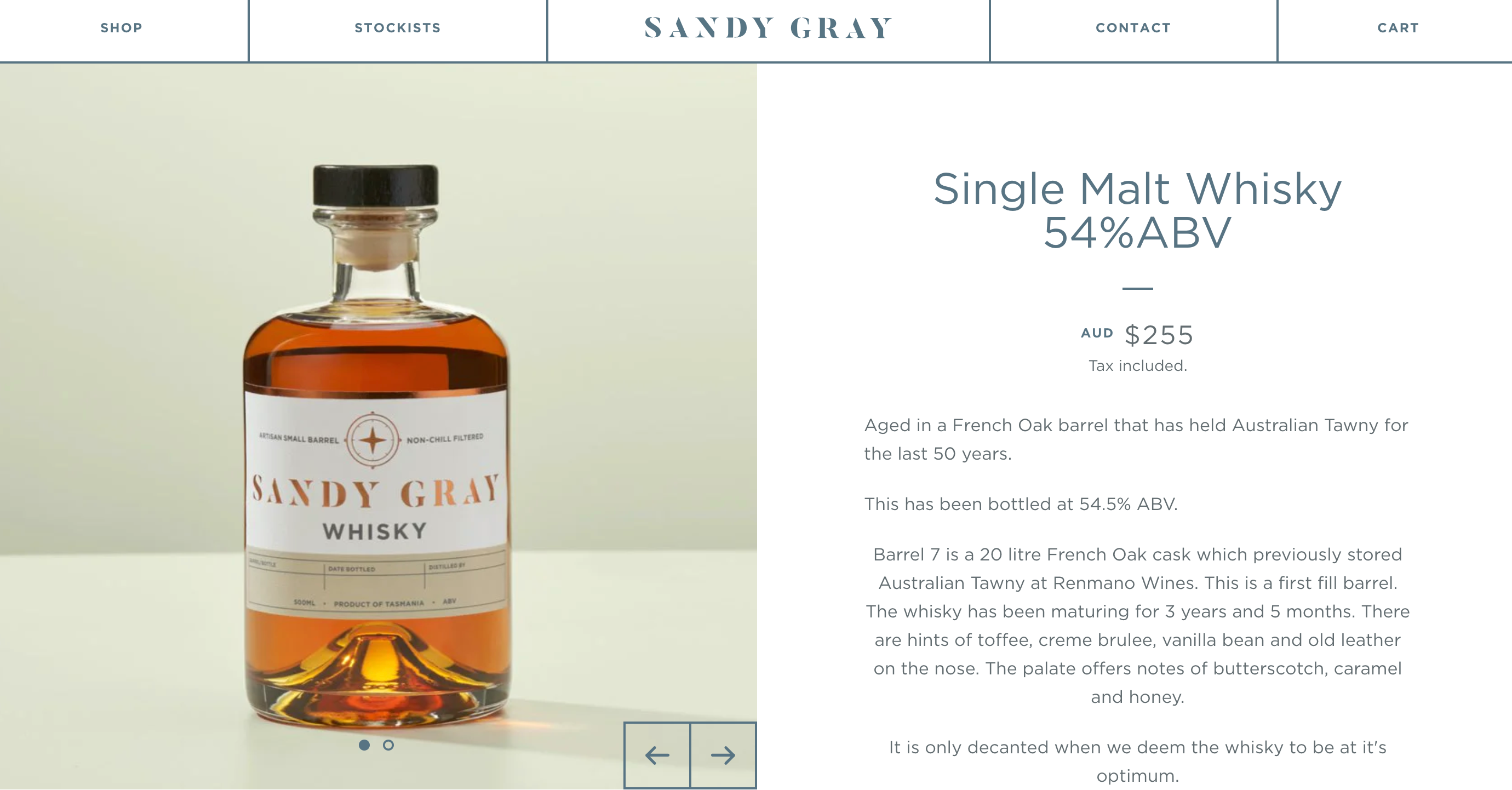
- They use a dark and classy background that contrasts with their product image and creates a luxurious feel.
- They use a video that shows their product in action, such as pouring, swirling, or tasting.
- They use a slider that allows visitors to explore their different products and variants.
- They use a tabbed layout that organizes their information into categories, such as description, tasting notes, awards, or reviews.
What you can learn from them:
- Use a background color that matches your brand identity and creates a mood.
- Use a video that shows your product in action, such as how it works, how it looks, or how it feels.
- Use a slider or a carousel that allows visitors to explore your different products and variants.
- Use a tabbed layout or an accordion that organizes your information into categories and saves space.
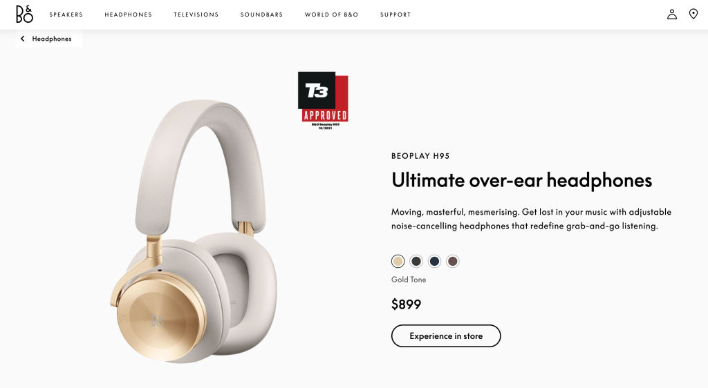
4. Bang & Olufsen
Bang & Olufsen is a Danish company that produces high-end audio products, such as headphones, speakers, or sound systems. Their product page design is sleek and modern, reflecting their brand values and innovation.
What they do well:
- They use stunning images that show their products in different settings and scenarios, such as home, office, or outdoors.
- They use bold and catchy headlines that highlight their product features and benefits, such as “Wireless freedom”, “Signature sound”, or “Crafted for comfort”.
- They use icons and charts to illustrate their technical specifications and performance, such as battery life, frequency range, or noise cancellation.
- They use a comparison tool that allows visitors to compare their products with other models or brands.
What you can learn from them:
- Use stunning images that show your products in different settings and scenarios, such as how they fit into the lifestyle of your target audience.
- Use bold and catchy headlines that highlight your product features and benefits, such as what makes them unique, superior, or desirable.
- Use icons and charts to illustrate your technical specifications and performance, such as how they measure up to industry standards or expectations.
- Use a comparison tool that allows visitors to compare your products with other models or brands.
5. Under Armour
Under Armour is an American company that produces sports apparel, footwear, and accessories. Their product page design is sporty and energetic, reflecting their brand mission and vision.
What they do well:
- They use realistic and action-packed images of athletes and fitness enthusiasts using their products.
- They use short and snappy headlines that convey their product benefits and advantages, such as “Lightweight”, “Breathable”, or “Durable”.
- They use badges and labels to indicate their product features and attributes, such as “Best seller”, “New arrival”, or “Heat Gear”.
- They use social media buttons to encourage visitors to share their products with their friends and followers.
What you can learn from them:
- Use images of your products being used by your target audience or influencers that are realistic and action-packed.
- Use short and snappy headlines that convey your product’s benefits and advantages, such as how they solve a problem, meet a need, or fulfill a desire.
- Use badges and labels to indicate your product’s features and attributes, such as what makes them popular, special, or exclusive.
- Use social media buttons to encourage visitors to share your products with their friends and followers.
6. Kershaw
Kershaw is an American company that produces knives for various purposes, such as hunting, fishing, camping, or everyday use. Their product page design is rugged and functional, reflecting their brand promise and quality.
What they do well:
- They use clear and detailed images that show their products from different perspectives and in different situations.
- They use descriptive and informative headlines that explain their product names and functions, such as “A versatile pocket knife for outdoor adventures” or “A sleek flipper knife with SpeedSafe assisted opening”.
- They use bullet points and tables to list their product specifications and features, such as blade length, weight, material, or warranty.
- They use videos to demonstrate how to use their products safely and effectively.
What you can learn from them:
- Use clear and detailed images that show your products from different perspectives and in different situations.
- Use descriptive and informative headlines that explain your product names and functions, such as what they are designed for, what they can do, or how they can help.
- Use bullet points and tables to list your product specifications and features, such as what they are made of, how they perform, or what they include.
- Use videos to demonstrate how to use your products safely and effectively, such as how to open, close, or sharpen them.
7. Vitra Product Pages
Vitra is a Swiss company that produces furniture and accessories for the home and office. Their product page design is minimalist and elegant, reflecting their brand philosophy and aesthetics.
What they do well: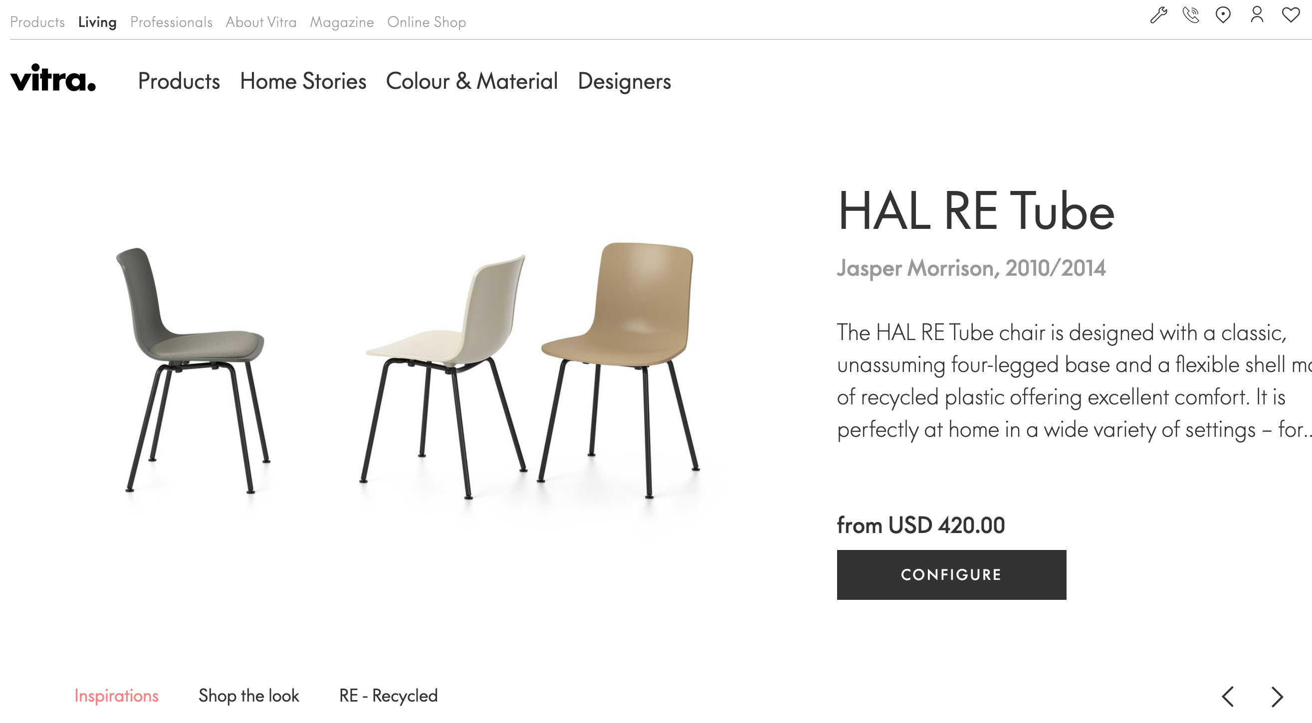
- They use simple and clean images that show their products against a white background or in a stylish setting.
- They use short and subtle headlines that state their product names and categories, such as “Eames Lounge Chair and Ottoman” or “Accessories Collection”.
- They use icons and links to provide more information about their products, such as the designer, the story, the materials, or the dimensions.
- They use a color picker that allows visitors to customize their products according to their preferences.
What you can learn from them:
- Use simple and clean images that show your products on a white background or in a stylish setting, depending on your brand identity and style.
- Use short and subtle headlines that state your product names and categories, such as what they are called and what they belong to.
- Use icons and links to provide more information about your products, such as who made them, why they are special, what they are composed of, or how big they are.
- Use a color picker or a similar tool that allows visitors to customize your products according to their preferences.
8. Bennett Tea
Bennett Tea is a British company that offers a range of premium teas and infusions. They design product pages with cozy and charming, reflecting their brand heritage and culture.
What they do well:
- They use warm and inviting images that show their products in a teacup or tea pot, along with some snacks or decorations.
- They use catchy and descriptive headlines that highlight their product flavors and aromas, such as “A zesty blend of lemon and ginger” or “A fragrant infusion of rose petals and hibiscus”.
- They use ratings and reviews to showcase their product quality and popularity, along with some customer photos and feedback.
- They use a subscription option that allows visitors to save money and time by receiving their products regularly.
What you can learn from them:
- Use warm and inviting images that show your products in a teacup or in a teapot, along with some snacks or decorations, depending on your product type and niche.
- Use catchy and descriptive headlines that highlight your product flavors and aromas, such as what they taste like, smell like, or feel like.
- Use ratings and reviews to showcase your product’s quality and popularity, along with some customer photos and feedback.
- Use a subscription option or a similar offer that allows visitors to save money and time by receiving your products regularly.
9. Apple
Apple is an American company that produces consumer electronics, software, and online services. Their product page design is sleek and futuristic, reflecting their brand innovation and leadership.
What they do well:
- They use stunning images and videos that show their products in action, such as using the camera, playing games, or watching movies.
- They use bold and powerful headlines that emphasize their product features and benefits, such as “The ultimate iPhone” or “The most powerful iPad ever”.
- They use interactive features that allow visitors to explore their products in detail, such as rotating them, changing the color, or comparing the models.
- They use testimonials and stories to showcase how their products can improve the lives of their customers, such as by enhancing their creativity, productivity, or health.
What you can learn from them:
- Use stunning images and videos that show your products in action, such as how they work, how they look, or how they feel.
- Use bold and powerful headlines that emphasize your product’s features and benefits, such as how they are unique, superior, or desirable.
- Use interactive features that allow visitors to explore your products in detail, such as rotating them, changing the color, or comparing the models.
- Use testimonials and stories to showcase how your products can improve the lives of your customers, such as by enhancing their creativity, productivity, or health.
10. Lush
Lush is a British company that produces handmade cosmetics and personal care products. Their product page design is colorful and fun, reflecting their brand values and ethics.
What they do well:
- They use vibrant and playful images that show their products in a natural or whimsical way, such as in a flower pot, in a bathtub, or in a candy jar.
- They use catchy and humorous headlines that describe their product names and effects, such as “The Comforter” or “Dream Cream”.
- They use icons and labels to indicate their product ingredients and attributes, such as “Vegan”, “Self-preserving”, or “Naked”.
- They use videos to show how their products are made, used, or recycled, highlighting their freshness, quality, and sustainability.
What you can learn from them:
- Use vibrant and playful images that show your products in a natural or whimsical way, depending on your product type and niche.
- Use catchy and humorous headlines that describe your product names and effects, such as what they are called and what they do.
- Use icons and labels to indicate your product ingredients and attributes, such as what they are made of, how they are preserved, or how they are packaged.
- Use videos to show how your products are made, used, or recycled, highlighting their freshness, quality, and sustainability.
11. Lego
Lego is a Danish company that produces plastic building toys for children and adults. Their product page design is creative and interactive, reflecting their brand vision and mission.
What they do well:
- They use realistic and colorful images that show their products in different scenes and scenarios, such as in a city, a castle, or a spaceship.
- They use descriptive and informative headlines that state their product names and categories, such as “LEGO City Fire Station” or “LEGO Harry Potter Hogwarts Castle”.
- They use buttons and links to provide more information about their products, such as the number of pieces, the age range, the difficulty level, or the instructions.
- They use a 3D viewer that allows visitors to see their products from different angles and zoom in or out.
What you can learn from them:
- Use realistic and colorful images that show your products in different scenes and scenarios, such as how they fit into the imagination of your target audience.
- Use descriptive and informative headlines that state your product names and categories, such as what they are called and what they belong to.
- Use buttons and links to provide more information about your products, such as how many parts they have, how old they are suitable for, how hard they are to build, or how to assemble them.
- Use a 3D viewer or a similar tool that allows visitors to see your products from different angles and zoom in or out.
12. Casper
Casper is an American company that produces mattresses, pillows, bedding, and other sleep-related products. Their product page design is cozy and relaxing, reflecting their brand promise and value.
What they do well:
- They use soft and soothing images that show their products in a comfortable and inviting setting, such as in a bedroom, on a couch, or on a hammock.
- They use simple and friendly headlines that state their product names and benefits, such as “The Casper Mattress” or “The Pillow for Every Sleeper”.
- They use ratings and reviews to showcase their product quality and satisfaction, along with some customer photos and feedback.
- They use a quiz that helps visitors find the best product for their needs, preferences, and budget.
What you can learn from them:
- Use soft and soothing images that show your products in a comfortable and inviting setting, depending on your product type and niche.
- Use simple and friendly headlines that state your product names and benefits, such as what they are called and what they do.
- Use ratings and reviews to showcase your product quality and satisfaction, along with some customer photos and feedback.
- Use a quiz or a similar tool that helps visitors find the best product for their needs, preferences, and budget.
13. Glossier
Glossier is an American company that produces skincare and makeup products. Their product page design is minimalist and chic, reflecting their brand philosophy and aesthetics.
What they do well: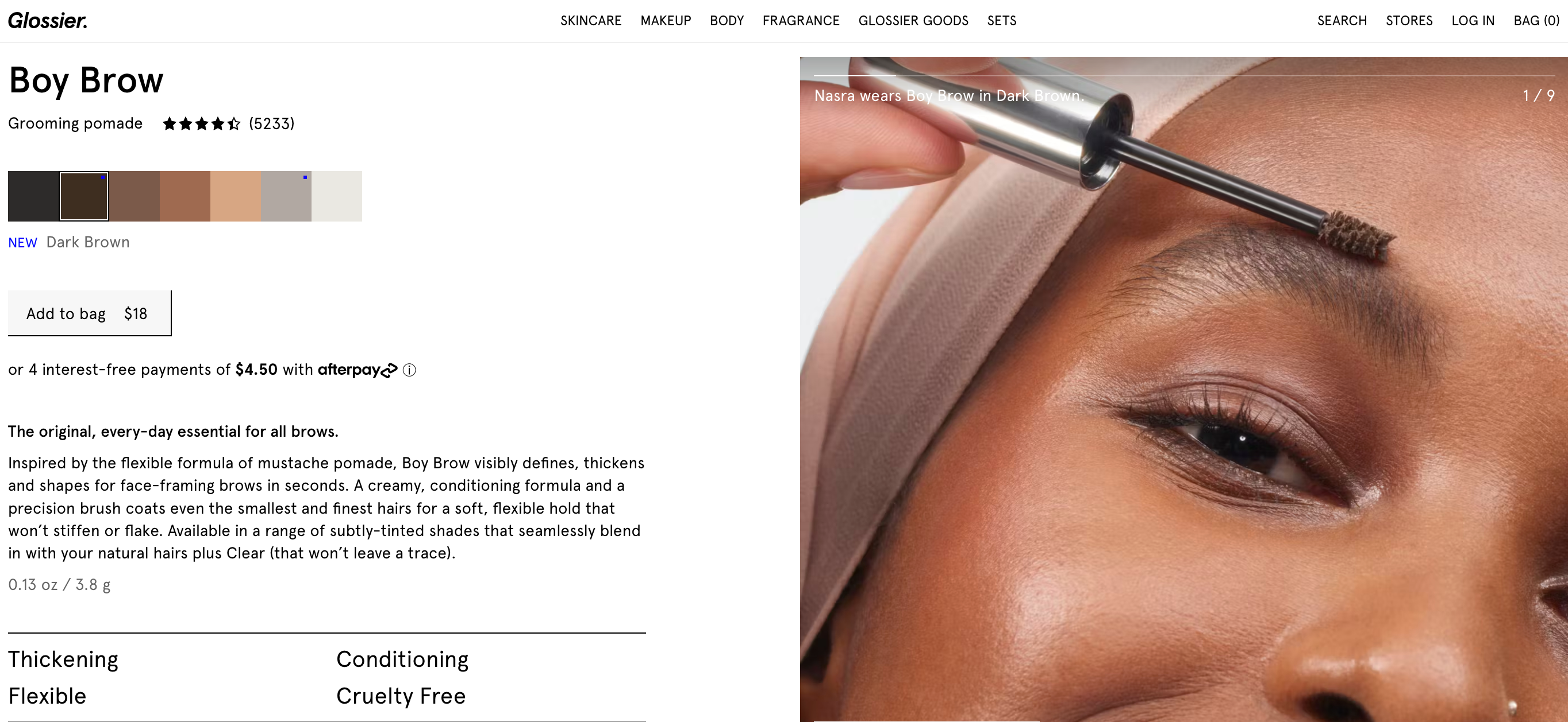
- They use simple and elegant images that show their products in a white background or on different models.
- They use short and catchy headlines that state their product names and effects, such as “Boy Brow” or “Cloud Paint”.
- They use swatches and sliders to display their product colors and shades, allowing visitors to see how they look on different skin tones.
- They use testimonials and stories to showcase how their products can enhance the beauty and confidence of their customers.
What you can learn from them:
- Use simple and elegant images that show your products in a white background or on different models, depending on your brand identity and style.
- Use short and catchy headlines that state your product names and effects, such as what they are called and what they do.
- Use swatches and sliders to display your product colors and shades, allowing visitors to see how they look on different skin tones.
- Use testimonials and stories to showcase how your products can enhance the beauty and confidence of your customers.
14. Allbirds
Allbirds is an American company that produces shoes made from natural materials, such as wool, eucalyptus, or sugarcane. Their product page design is eco-friendly and stylish, reflecting their brand values and ethics.
What they do well:
- They use natural and vibrant images that show their products in different environments and seasons, such as in a forest, in a city, or in snow.
- They use descriptive and informative headlines that state their product names and features, such as “Wool Runners” or “Tree Toppers”.
- They use icons and labels to indicate their product materials and attributes, such as “Made from wool”, “Machine washable”, or “Carbon neutral”.
- They use a video that shows how their products are made, used, or recycled, highlighting their sustainability, quality, and comfort.
What you can learn from them:
- Use natural and vibrant images that show your products in different environments and seasons, depending on your product type and niche.
- Use descriptive and informative headlines that state your product names and features, such as what they are made of, how they are maintained, or how they are eco-friendly.
- Use icons and labels to indicate your product materials and attributes, such as what they are composed of, how they are preserved, or how they are packaged.
- Use a video that shows how your products are made, used, or recycled, highlighting your sustainability, quality, and comfort.
15. Nespresso
Nespresso is a Swiss company that produces coffee machines and capsules. Their product page design is sophisticated and elegant, reflecting their brand personality and quality.
What they do well:
- They use sleek and stylish images that show their products in a black background or in a kitchen setting.
- They use bold and powerful headlines that state their product names and benefits, such as “Vertuo Next” or “The Ultimate Coffee Experience.”.
- They use buttons and links to provide more information about their products, such as the features, specifications, reviews, or accessories.
- They use a subscription option that allows visitors to save money and time by receiving their products regularly.
What you can learn from them:
- Use sleek and stylish images that show your products against a black background or in a kitchen setting, depending on your brand identity and style.
- Use bold and powerful headlines that state your product names and benefits, such as how they are unique, superior, or desirable.
- Use buttons and links to provide more information about your products, such as how they work, how they perform, or what they include.
- Use a subscription option or a similar offer that allows visitors to save money and time by receiving your products regularly.
As you can see, there are many ways to design product pages that sell. The key is to understand your brand identity, your target audience, and your product value proposition, and then use the best practices and tips we shared in this blog post to design product pages that capture attention, provide information, build trust, and encourage action.
We hope you enjoyed this blog post and found some inspiration from the great product page design examples we provided. If you require additional assistance with your product page design or any other aspect of your online store, please do not hesitate to contact us. We are an e-commerce design and development team that can assist you in creating a visually appealing and functional online store that sells.